The logo turned up as a flat picture?
A client, an old brand kit, a screenshot lifted out of a deck — the logo exists, just not as anything you can resize, recolour or hand to a printer. Vectron traces it back into flat shapes with sharp corners, in about two seconds, in this tab.
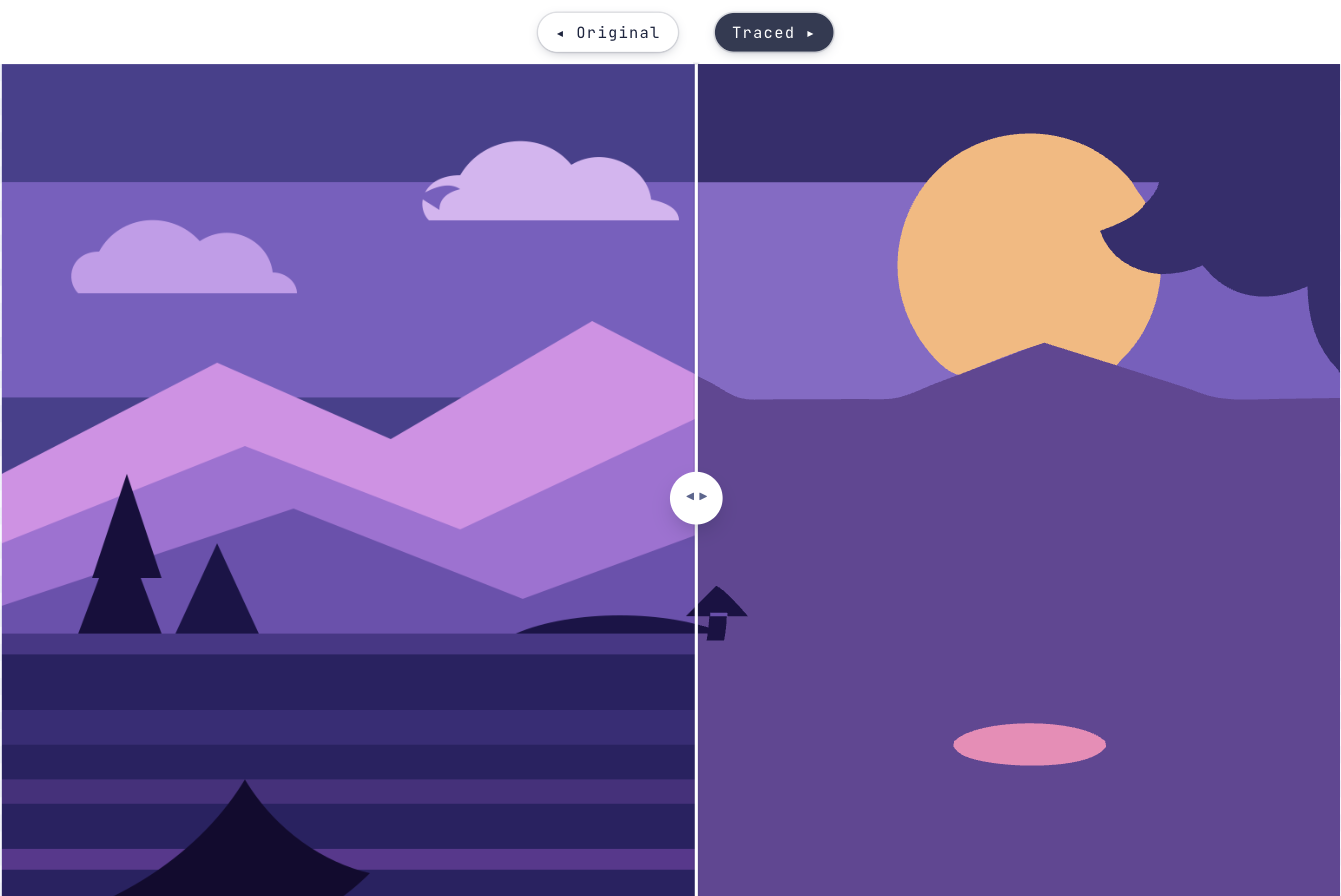
Why a logo has to be a vector
A logo is the one piece of artwork that gets used at every size there is — a favicon, an email footer, a shirt, the side of a van. A raster file has exactly one resolution, and everything above it is a blur.
Traced to SVG it becomes flat fills and real corners: recolour it for a dark background, scale it to a billboard, or hand a single-colour version to a printer, an embroiderer or a cutter without redrawing anything.
How long does this actually take?
Long enough to find the file. Two of these six only matter if the mark is fiddly.
Start tracing- 1Add the logoPNG, JPEG, GIF, WEBP or BMP. The bigger the source, the more there is to trace.
- 2Start from Logo / FlatExact flat fills and sharp corners — two colours by default rather than a gradient of near-identical shades.
- 3Drop the backgroundA mark on white loses the white, so the cut-out sits on any colour you like. Use the pipette when the corners are not the background.
- 4Check the wordmark at 400%Lettering is where a trace shows its seams. Zoom in before you decide it is finished.
- 5Refine an area over anything intricateA monogram, a thin serif, a detailed crest — give just that box its own settings instead of compromising the whole logo.
- 6Download the SVGFilled paths, ready for Illustrator, Figma, Inkscape or a production file.
Getting a logo that survives the trace
Still wondering?
Yes, and it is the common case. JPEG compression leaves soft, speckled edges around a mark, so start from Logo / Flat, keep the colour count low, and raise Ignore tiny specks until the fringing goes.
If you turn on Drop the background, yes. Vectron guesses the background colour from the corners and removes it, and the pipette is there for the cases where the corners are not the background.
The output is a plain SVG of filled paths, which is what those workflows ask for. Check the result at 400% first — a trace of a small or heavily compressed source can carry wobble that only shows at size.
Switch What should come out to B/W. That traces the mark as one shape rather than as coloured layers, which is what a stencil, a cut sticker or an embroidery file needs.
No — and nothing that traces a picture can. Letters come back as outlined shapes. They scale and recolour perfectly, but changing the wording means setting the type again.
Bringing something else to Vectron?
Got that file open in another tab?
Drag it over. Worst case you’ve lost ten seconds and learned what your artwork looks like in vectors.
Open Vectron